According to a report by Lucidpress, brands with consistent visual identity see an average 23% increase in revenue. Yet many businesses still fail to implement their logo correctly across platforms—leading to blurry prints, stretched web graphics, or inconsistent branding that confuses customers.
Your logo is more than a design—it’s the cornerstone of your visual identity system. Whether it appears on a billboard, a smartphone, or a business card, it needs to be sharp, recognizable, and aligned with your brand. This guide will help you master the art of using your logo across media—both print and digital branding—without losing its power.
Understand the Key Differences Between Print and Digital Media
The requirements for logos for print and web are fundamentally different. While digital media uses RGB color and often favors flexible, responsive logos, print relies on high-resolution files, CMYK color, and precise scaling. If you’re starting with an AI logo generator, make sure to adapt the output for each medium to maintain visual integrity and brand consistency.
Key Considerations:
| Media Type | Color Mode | Resolution | Format |
| CMYK | 300 DPI | PDF, EPS, AI | |
| Digital | RGB | 72–144 DPI | PNG, SVG, JPEG |
Using the wrong file or color mode can lead to poor reproduction—like muted colors on brochures or pixelated logos on websites.
Example:
A startup printed business cards using an RGB logo file, resulting in dull and inaccurate colors. The issue was fixed by switching to a CMYK-based high-resolution logo format.
Choose the Right Logo File Formats
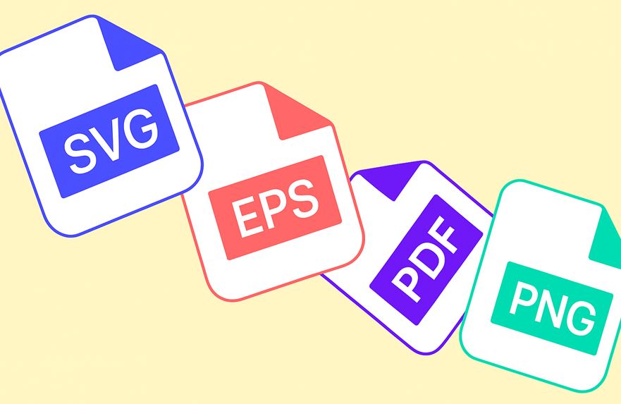
Every platform requires a specific logo format. Knowing when to use SVG, PNG, or EPS can make or break your visual impact.
Common Logo File Types:
- SVG: Ideal for websites and apps. Scalable and lightweight.
- PNG: Perfect for transparent backgrounds in digital use.
- JPEG: Good for online use, but avoid for logos with transparency.
- EPS/PDF: Standard for print. Preserves vector quality at any size.
- AI: Adobe Illustrator file for editing the master version.
Pro Tip: Always request a complete brand kit with multiple file formats when working with a designer.
Maintain Brand Consistency Across All Channels
Consistency builds trust. Inconsistent logo use—wrong colors, incorrect sizing, off-brand positioning—can dilute your identity and confuse your audience.
Best Practices for Consistent Branding:
- Use a logo usage guidelines document (often part of a brand style guide).
- Define minimum clear space, scaling rules, and background color compatibility.
- Always apply logos in approved color versions: full color, monochrome, and inverted.
Case Study:
Spotify enforces tight control over their logo usage with a comprehensive style guide, ensuring consistent presentation across billboards, podcasts, and app stores.
“A logo is only as strong as the consistency behind it. Whether on a screen or in print, it needs to behave predictably—like a signature. It’s not just design, it’s trust in visual form.”
— Victoria Maybach, Head of SEO at Turbologo
Make Your Logo Scalable and Responsive
A modern logo must adapt to different screen sizes and platforms. This is where responsive logo design comes in—creating multiple logo variations optimized for various screen sizes or print materials.
Types of Responsive Logo Variations:
- Full logo (icon + name) for large screens or print
- Compact version (icon only) for app icons or favicons
- Stacked or horizontal variations for layout flexibility
Example:
Google’s “G” icon is instantly recognizable on mobile devices, while its full logotype appears on wider interfaces. This versatility comes from a scalable visual identity system.
Optimize Your Logo for Each Use Case
One size does not fit all. Without proper logo optimization, your logo may not load correctly on websites or may appear pixelated in print.
Step-by-Step Logo Optimization Checklist:
- Define logo variations for light and dark backgrounds.
- Use CMYK for print, RGB for digital.
- Export in appropriate file types (PDF/EPS for print, SVG/PNG for web).
- Set proper resolution: 300 DPI for print, 72–144 DPI for web.
- Test readability at different sizes (especially for small formats like email signatures or favicons).
- Compress files for the web without compromising quality.
Bonus Tip: Use Figma or Adobe Illustrator to test your logo at different sizes and in mockups for better real-world previews.
Build a Logo That Works Wherever You Are
Your logo is your silent ambassador. Treat it with the care it deserves. By understanding the nuances of using your logo across media, choosing the right formats, and ensuring consistent branding, you protect your brand’s reputation—and enhance it.
Whether you’re printing brochures or launching an app, these principles of scalable logo, logo placement tips, and color mode adaptation ensure your logo always performs at its best.


